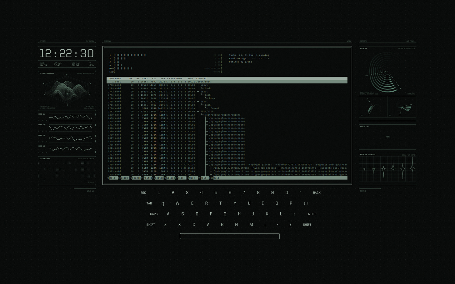
Widgets on the desktop. Widgets on the lock screen. Like many Apple features, widgets on the desktop originated with the hacker community for decades before being formally adopted in the proprietary distribution.

(from user nnkd on Reddit, 9 years ago).
I used to be part of these communities, which usually involved modifying Unix window managers and desktop environments to have dynamic information — stats, graphs, scripts, and more. So some thoughts on historically what’s worked well (and not so well) for the widgetification of the desktop.
- Latency — This seems to be the biggest problem that Apple fixed. Without deep integration, running interactive (or periodically updated) widgets on the desktop in the background is extremely difficult. Obviously, being vertically integrated from chip to software helps.
- Ecosystem / API — It’s too early to tell if Apple can successfully build an ecosystem around widgets. It’s hard to build a generic API for widgets — by definition, widgets do almost everything. As well as the crossover between iOS and macOS widgets (via Continuity). Most of the widgets were hand-crafted for the Unix desktop environments, and it was difficult to find a themeable set that reused widgets from another set. Widgets have existed for some time on iOS but haven’t had serious adoption (at least from developers and applications, based on my own experience).
- Usefulness — So far, widgets on the desktop have been useful for me, mostly for Apple-based applications. It allows me to get a quick glance at my notes, reminders, or calendar. But I can’t imagine serious applications taking up real estate here.
- Aesthetics — The customization and widgetification of the latest iterations of Apple’s software remind me of the difference between early Facebook and MySpace. The former eschewed any customization. No music on your profile, no custom backgrounds or HTML, and no special layouts. Everything was uniform. The latter allowed nearly full customization of your page (a mistake; see the footnote at the end). While this proved to be a growth hack early on, it inevitably made site-wide product improvements difficult. While the best Unix programmers with a design sense could make their custom layouts beautiful, the majority of customizations ended up either beautiful but not functional or functional and unfriendly. With Apple’s widget layouts and API, the answer to this depends on how much they end up exposing. Too much, and it’s difficult to create a cohesive feeling (the core of the Apple brand, to some degree). Too little, and widgets will be stunted in usefulness. I’m not sure what the right trade-off is.
While rebuilding the site, Harriman and Nguyen made a mistake. Normally, websites that accept contributions from users—such as text entries or photographs—block users from inserting Web markup language, such as HTML, into those submissions. Web markup language is the computer code that controls what appears on a webpage, such as the colors or fonts or background images. But Nguyen forgot to block Web markup language in user submissions.
His mistake allowed users to build colorful backgrounds and wallpaper and load them onto their MySpace pages. Suddenly teenage girls could decorate their MySpace page with hearts and glitter and smiley faces the same way that they were decorating their lockers and book bags. At first MySpace didn't realize what had happened[…] — excerpt from Stealing MySpace by Michael Agger